Aviso de Abertura do Concurso para Atribuição de Bolsas de Investigação para Doutoramento em ambiente não académico, nos domínios científicos...

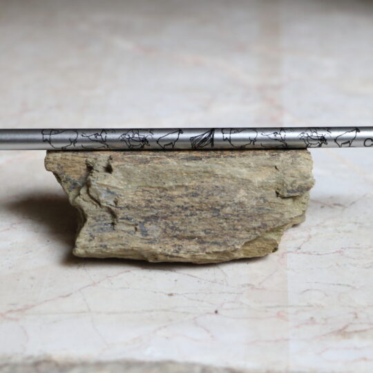
Como uma imensa galeria ao ar livre, o Vale do Côa apresenta mais de mil rochas com manifestações rupestres, identificadas em mais de 80 sítios distintos, sendo predominantes as gravuras paleolíticas, executadas há cerca de 30.000 anos
VÍDEO
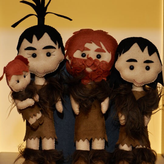
Cenas da vida quotidiana dos Artistas Paleolíticos do Vale do Côa

Actualidade
Notícias & Destaques

Convite para inauguração da exposição “Da Lei do Mundo”
A Presidente da Fundação Côa Parque, Aida Carvalho e a Fotógrafa Fátima Carvalho, têm a honra de convidar para a...

Boas Festas
A Fundação Côa Parque deseja a todas e a todos um Natal repleto de paz, felicidade e harmonia e um...

Conferência Internacional – Alterações Climáticas e Património Mundial
A inscrição dos Sítios de Arte Rupestre do Vale do Côa, na lista do Património Mundial, representou uma conquista coletiva...

CôaMedPlants
No Dia Nacional da Cultura Científica, 24 de novembro, iremos conhecer os resultados de um dos projetos financiados pela FCT...

XI Bienal Douro 2023
No âmbito do 27º aniversário do Parque Arqueológico do Vale do Côa, a 11 de agosto irá ser inaugurada a...
No Museu
Exposições

Da Lei do Mundo
O Cântico dos Cânticos do mundo vegetal, as flores e os frutos, são o anzol onde a cor e a...

MOMENTOS e Rosalina Santos NO INTERIOR DA TERRA em Freixo de Numão
Em 2018 a autora realizou uma visita à mina de prospeção aurífera em Freixo de Numão, no que inicialmente seria...
")
Paula Rego: rutura e continuidade
Paula Rego (1935-2022) é uma das artistas portuguesas contemporâneas mais conhecidas mundialmente. Residiu e trabalhou em Londres, cidade onde estudou...

Todos os Animais
“Todos os animais”, obra realizada por Luís Paulo Costa entre 2020 e 2021 é constituída por uma série de centena...

XI Bienal Gravuras do Douro 2023
A Bienal Internacional Gravura Douro 2023, que será inaugurada na sala 1 do Museu do Côa conta com obras de...
")
Reserva da Faia Brava – Criando Espaços para a natureza no Vale do Côa
Inaugurou-se no passado dia 7 de junho a exposição fotográfica resultante de uma parceria entre a Fundação Côa Parque e a Associação Transumância e...